Chapter 6 Microbiome Analysis
Exploratory Data Analysis is perhaps the most insightful step we can do during microbiome analysis. It usually aims to discover patterns that may best distinguish and explain the data. Exploratory Data Analysis utilize visualization of the data by using common plots and multivariate projections such as PCoA.
6.1 Multivariate Projection
The first explanatory data analysis we will do is to perform multivariate projection of our sample data. This is to discover pattern that might best distinguish our data and use it for further analysis.
Before visualization, it is common to normalize our data. We can use transform_sample_counts() to define our specific function. In this example, we will log-transform our original abundance data as an approximate variance stabilizing transformation Ben J. Callahan (2016). We will use column When from sample data to annotate plots.
# making ordinate
out_wuf_log <- ordinate(ps_log,
                        method = "MDS", # for PCoA
                        distance = "wunifrac") # weighted Unifrac distance
# prepare eigen values to adjust axis
evals <- out_wuf_log$values$Eigenvalues
plot_pcoa<- plot_ordination(ps_log, out_wuf_log, color = "When") +
geom_text(aes(label = sample_names(ps_log)), size = 3, nudge_y = 0.02) +
labs(col = "Sampling Period") +
# to adjust axis length based on eigen values (variance it contains)
coord_fixed(sqrt(evals[2] / evals[1])) 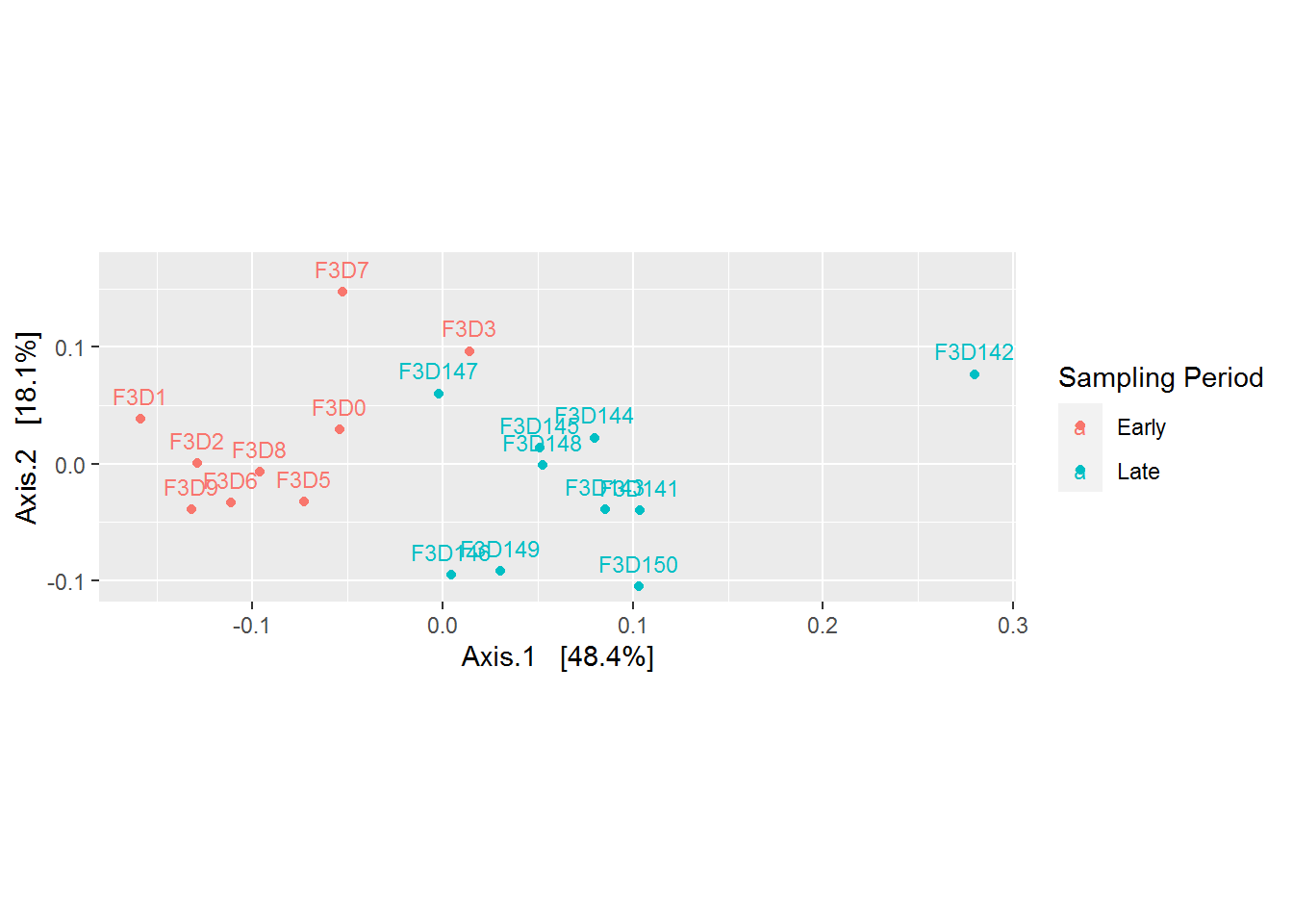
Based on the plot above, it is becoming more clear that there is a difference between microbial community came from the early and late sampling period. Refering back to our research question, “the mice gut microbiome on the 10 days of post weaning (eating) period did encounter a shift/changes when we compared it to its late period”. But what are the changes? This can be explored more by plotting microbial abundance of our samples.
Besides discovering patterns, PCoA plot also useful for telling us whether there are outliers in our data. From the plot above, the sample F3D142 seems to be an outlier. We can remove the data before further analysis.
6.2 Microbial Abundandce
The next explanatory data analysis we will do is to check the microbial abundance within each sample (microbial sequence count per sample). Before visualization, it is common to normalize our abundance data. Same as before, we can use transform_sample_counts() to define our specific function. In this example, we will converts the microbial count stored in the ps_cut into frequencies per total count for each sample a.k.a proportions or relative abundance.
Here’s our abundance data before and after transformation:
## OTU Table:          [3 taxa and 6 samples]
##                      taxa are columns
##        ASV5 ASV8 ASV11
## F3D0    173  185   111
## F3D1    140  191   284
## F3D141  190  324   225
## F3D143  130   84   134
## F3D144  105   41   332
## F3D145 308 126 388## OTU Table: [3 taxa and 6 samples]
## taxa are columns
## ASV5 ASV8 ASV11
## F3D0 0.06995552 0.07480793 0.04488476
## F3D1 0.05513982 0.07522647 0.11185506
## F3D141 0.13868613 0.23649635 0.16423358
## F3D143 0.19877676 0.12844037 0.20489297
## F3D144 0.11972634 0.04675029 0.37856328
## F3D145 0.24463860 0.10007943 0.30818110In plotting microbial abundance it is best to follow our original research question, something that we really want to analyze. Like before, let’s plot the microbial abundance per sampling period. This information can support our analysis on our research question:
We want to understand the effect of the first 10 days of post weaning (eating) period to the stability of gut microbiome in the 140-150 day of post weaning period.
Now let’s plot our microbial abundace data using a DIY function. The function will result in microbial abundance per taxonomical rank we provided for each categorical features we ought to analyze.
Here are a list of Phylum taxonomical rank that we can analyze from the sample:
## [1] "Bacteroidota"      "Firmicutes"        "Proteobacteria"
## [4] "Campilobacterota"  "Actinobacteriota"  "Patescibacteria"
## [7] "Deinococcota"      "Verrucomicrobiota"
Note that in this tutorial, we only have the categorical features Day or When which stands for the day of sampling period.
##        Subject Gender Day  When
## F3D0         3      F   0 Early
## F3D1         3      F   1 Early
## F3D141       3      F 141  Late
## F3D143       3      F 143  Late
## F3D144       3      F 144  Late
## F3D145       3      F 145  Late
## F3D146       3      F 146  Late
## F3D147       3      F 147  Late
## F3D148       3      F 148  Late
## F3D149       3      F 149  Late
## F3D150       3      F 150  Late
## F3D2         3      F   2 Early
## F3D3         3      F   3 Early
## F3D5         3      F   5 Early
## F3D6         3      F   6 Early
## F3D7         3      F   7 Early
## F3D8         3      F   8 Early
## F3D9         3      F   9 Early
It is sufficient enough for our research question, therefore we’ll use that for analysis. But if your sample has more features to explore, you can explore it as much as you want with the DIY function below! Note that the DIY function will use functions from ggplot2 package so make sure you have loaded it into your session.
# DIY function
plot_abundance <- function(x = physeq, # phyloseq data
                           title = "",
                           Facet = "Phylum", # taxa rank for facets
                           Category = "When", # categorical features for x axis
                           Color = "Phylum",
                           legend = "none"
                           ) {

  mphyseq <- psmelt(x)
  mphyseq <- subset(mphyseq, Abundance > 0)

  ggplot(data = mphyseq,
         mapping = aes_string(x = Category,
                              y = "Abundance",
                              color = Color, fill = Color)
        ) +
    geom_violin(fill = NA) +
    geom_point(size = 1, alpha = 0.3,
               position = position_jitter(width = 0.3)) +
    facet_wrap(facets = Facet, ncol = 3) +
    scale_y_log10() +
    labs(title = title) +
    theme(legend.position = legend)
}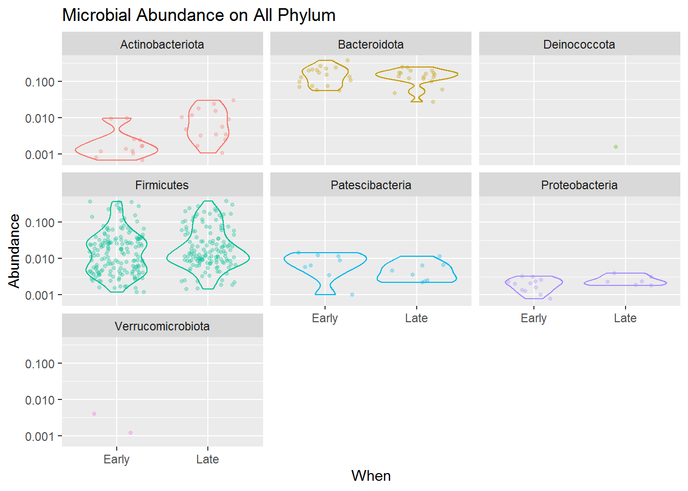
The combined jitter and density plot above shown how each microbes (point) present in our samples based on its relative abundance for both early and late sampling period. The wider the size of a violin plot, the higher frequencies or possibility of our sample having that score of abundance.
Based on the jitter visualization, we know that the Phylum Firmicutes dominates the mice gut microbiome compared to other taxa. That means the microbes present in the mice gut mostly comes from the Phylum Firmicutes, and then accompanied by some other microbes mostly from the Phylum Bacteroidota, Actinobacteria.
Although Firmicutes dominates the diversity of the mice gut microbiome, the violin plots also revealed that its abundance is highly varied from low to high abundance. Compared to Bacteroidota which, although only having some microbial species present in our sample, most of the species have a high abundance in our sample. Meanwhile, Actinobacteria, Patescibacteria and Proteobacteria present in a more lower abundance. This applies to both early and late mice age.
Another thing we can take from the plot is that the microbial community is slightly changing from the early to the late period of mice age. You can see that Firmicutes and Bacteriodota sligtly having lower abundance in its late period than its early one, and Actinobacteria which has slightly higher abundance in its late period.
By combining this microbial abundance and diversity data with the metabolic activities the microbiome can do (what kind of chemicals it can produce or consume in the gut) we may actually derive some insight on how the gut microbiome can affect the mice metabolic activity or even health.
You can try to detail the diversity even more. Below is the code to plot a more detailed plot, for only the Phylum Firmicutes.
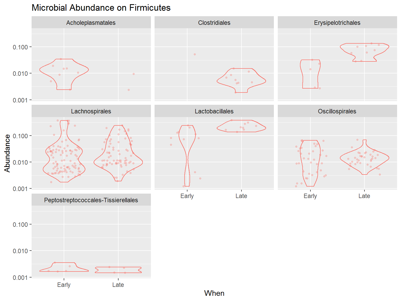
From the plot above we know that among Firmicutes, the order Lachnospirales and Oscillospirales dominates most of the microbes present in the community, although the relative abundance is quite varied. Instead, the order Lactobacillales, although only harbours a few microbes, most of the microbes from this order has higher abundance. This is especially happened during late period whereas all the microbes from this order has a high abundance in the community.
Additionally, phyloseq also provides other plot types commonly used to plot microbial abundance data. Such as this abundance bar plot below:
plot2 <- plot_bar(ps_relav, # using all data (relative abundance)
                  fill = "Phylum", # fill colour by Phylum.
                  x = "reorder(Sample, Day)") +
  labs(title = "Microbial Abundance of Murine Gut",
       subtitle = "Phylum Distribution",
       x = NULL) # to remove x-axis title
Using this plot_bar function, we may see a better visulization on the dynamics of murine gut microbial community during mice growth respective to its introduced diet.
Below is the plot for the relative abundance of the phylum Firmicutes. We can confirm that the order Lachnospirales and Lactobacillales have the highest abundance among all other order. We can also see that the Lactobacillales relative abundance has increased at the late period, furthermore, the order Erysipelotrichales has only appeared at the late period.
plot3 <- plot_bar(ps_firm, # using only firmicutes data
                  fill = "Order", # fill colour by order.
                  x = "reorder(Sample, Day)") +
  labs(title = "Microbial Abundance of Murine Gut",
       subtitle = "Phylum Firmicutes",
       x = NULL) # to remove x-axis title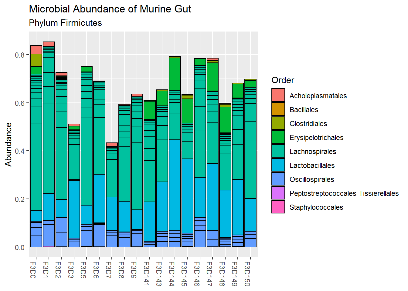
For more functions and visualization, you can go directly to the official demo page here.